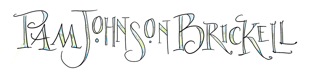

Blogger has introduced new page designs. I’ve been wanting to incorporate my own artwork into the banner design for quite a while. Why not do both??
Need your input, though. I’m not sure if the banner is toooooo large now. Perhaps it’s just because I’m used to the older, smaller page design. I’ve got a large screen though, so it works on my computer. How about yours?
Thanks for your input!

Thanks, Mary Jo! Hugs to all!
Hi Pam! Beautiful, beautiful as always! Happy Spring–MJ
Thank you, Debo, Lisa, Carmelina and Krista! I'm just waiting for time to replace the current header with the tweaked one. I appreciate all your comments.
Oooh… pretty!!!! I love the new look – all of it – nice clean lines, everything boxed up so nicely, and your banner is awesome!
Hello..
I don't know what your banner looked like before, but this one is gorgeously beautiful and it is NOT too large at all! I love it.
Glad to have come across your site!
going to browse around here some more…come by sometime for a visit!
creative carmelina
ciao bella
I think it looks really great Pam. Nice job!
Your art work on the banner is wonderful!! I also agree that your name should be larger/bolder. Maree has a point about making the banner shorter…Perhaps a shorter banner would allow for folks "browsing" to see more of your website without having to scroll down…But then your beautiful artwork on the banner will also bring them in. Tough decision! I really like the green boxes around all the different sections, especially the items on the right side.
Thanks, Ann! I agree about my name. It's rather squished in there 🙂
Thanks, Elizabeth! On my next tweak I'll try 150 ppi.
I do use Google Analytics but I get more info from SiteMeter (www.sitemeter.com).
It's a great header. I love seeing your art there. If you make it shorter don't let your name get any smaller. I'd actually like to see that a little bigger.
Looks gorgeous on my laptop! It does take longer to load, though. I've been saving things at 150 ppi (at original size) and that seems to preserve detail but still not be TOO large. I'm still a novice at sizing, though, and welcome any input on this!
As for largeness height-wise…there are two thoughts. I almost always scroll down anyway, and the banner is very inviting – rich in color, texture, and variation. So I don't mind that.
But I know that some people don't like to go "below the fold" (so to speak) to see if there is something there for them. Interesting that you're getting more readers this way! Do you use Google Analytics?
I like the new look!
Thank you all for your input, sometimes I get too close to figure out if my instincts are true.
Barb, thanks for your kind words and your input!
Maree, I have to agree. Perhaps if I add more to the sides I can shrink the top to bottom ratio. I tried tweaking it in photoshop but came up with fat birds and trees 🙂
No, I don't have a paid template. I pay blogger/google $10/yr for a custom name. You can find that info on your dash board under settings/publishing. The name of the new template is Awesome by Tina Chen and you can get to it thru the link on this post.
Laure, thanks for letting me know about impact. I have noticed I'm getting more readers vs just hits 🙂
Rhonda, thanks for letting me know about the download time. I left the image at 300 ppi. I was wondering if this would delay download.
Kate, thanks for your input. I'm glad it's working for most of you. Stay tuned. This non-geek is going to try some tweaks 🙂
It's gorgeous. I love it. My only nit is everything did take longer to load so I had to wait to start scrolling down to see everything 🙂 Love the artwork. I'd say, stay with it unless you get complaints.
I like it just the way it is. It's not that hard to scroll down. It's fun to use the tools on here to be creative — great that they are adding more!
Your banner looks wonderful on my laptop screen. 🙂
So very pretty!
Gee, the header is absolutely BEAUTIFUL Pam, but I also think it's a bit big… not the length, the width down, it takes up half of my (also big) screen. The problem is how to re-size without shortening the length… If you can sort that out, you've got a winner. Your template is a nice design, with the pages in the green bar – what template is it? I see you've got a www URL, is it a paid template?
Hey, Pam, nicely done on the new design! Love the clean look! I work on a laptop since my big desktop computer bit the dust last September, and this is fine for size. Yes, it's larger but makes more of an impact.